Tuesday, 25 September 2012
Jokerman font
Jokerman is a font style which is used on most computers as an option in which to type with. The font is used for more humourous purposes as it is completely random for each letter and each letter is created in a crazy way. It is a sans serif type font and looks like it mostly used for sending crazy messages.
Jokerman looks better as a larger font as the letters all sqaush together when they're too small making it illegible and it doesn't look great.
The font designer isAndrew Smith and it was first conceived in 1995.
An example of the font being used is on this poster of a clown as it is regularly depicted with a humourous theme due to how crazy the font is.
Wednesday, 19 September 2012
Photoshop Steps
First of all we opened photoshop and selected a new page. We put the page to 300 DPI (Dots Per Inch) as this was the best quality for the image. Next we saved a chosen image off the internet and opened it on photoshop. Then we used the lasso tool to cut around the image leaving just the picture we chose. After that we got an image of a background and put that onto photoshop, we resized it to fit the page and held down the 'shift' button to make sure the image still remained crisp and not stretched. Afterwards we copied our other chosen image (which was a celebrity) onto the background four times. We then made the image blend with the background using different photoshop techniques. Afterwards we did an image of our own personal choice so we could test out our new photoshop skills. My photoshop shut down before I could save the image so I can't put the image on here.
Image 5/5
Friday, 14 September 2012
Image 4/5
This image was drawn by Jack Kirby, who is one of my most favourite drawers of all time. The image is vibrant and colourful helping to induce a realistic tone to it. The image depicts an iconic comic book moment in Marvels' history which shows Captain America living again. This could have turned out to be a terrible story but it isn't due to Jack Kirbys' amazing art style. It appeals to me because of how brilliant the design is on the cover as it is full of some of Marvels' most iconic characters.
Image 3/5
This image is from one of my favourite video games of all time and one of my favourite game developers as well. The image is dynamic and shows destruction which appeals to most fans of this genre of game, which is action/adventure. The cover uses a blend of light and dark colours to induce an extreme feeling of realism which appeals to me particularly, because it shows the level of detail and work which has gone into the cover.
The reason this really appeals to me is brcause of how interesting the cover is. It looks extremely interesting and is drawn very professionally which is how I want to draw. The naughty dog team all put work into this which really shows as its' finish is amazing.
The reason this really appeals to me is brcause of how interesting the cover is. It looks extremely interesting and is drawn very professionally which is how I want to draw. The naughty dog team all put work into this which really shows as its' finish is amazing.
Picture Blog 2/5
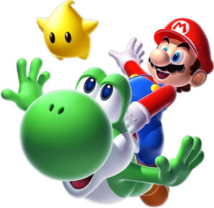
The image was drawn by a man named Shigeru Miyamoto and he is another of my inspirations. The picture itself comes from a game boxart. The image has bright, vibrant colours which helps it to really stand out. Its' lighting effects give it an extra feeling of realism which adds to the overall effect of the image. The first reason I like this image is because it features two of my favourite video game characters, Mario and Yoshi. This means that when I see this in a shop it appeals to me more than anything else. Secondly, its' bright colours capture my attention and it would probably catch the eye of others who go past this in the shop too.
The image also isn't dull and boring and has a lot of life in it, giving it a more realistic feel. The game this came from is Super Mario Galaxy 2.
The image also isn't dull and boring and has a lot of life in it, giving it a more realistic feel. The game this came from is Super Mario Galaxy 2.
Picture blog 1/5
The artist who drew this piece is called John Romita. The drawing is interesting and dynamic, making it look like it is a real image and not just a comic drawing. The colours are bright and vibrant and help the image stand out. The image would be easily seeable amongst others because of this. The reason I like this is because it is bright and interesting and is drawn to a high standard and this inspires me to do better in my work.
The art style is also one of the reasons I think this is good as it is expertly drawn and incorporates shadows on the character to make it realistic.
The art style is also one of the reasons I think this is good as it is expertly drawn and incorporates shadows on the character to make it realistic.
Subscribe to:
Comments (Atom)

